Category Archives: design

How to write more fun mail – Part 1

IMG_3870

streetside table + almond milk latte + stationary on hand = perfect letter writing conditions.

First off, let’s talk environment.  Is there a place in your house that you gravitate most to – one with good light, a flat surface and a comfortable seat?  Maybe when you’re on campus with time to kill between classes there is a picnic table en-plein-air that calls to you?   When writing, do you like to fly solo with nothing but the breeze as your soundtrack, or do you prefer the low din of a public place for maximum productivity?  More often than not,  when I find myself in a cafe at a sunlit table and  happily caffeinated, the letter-writing muse strikes!  Having lamented the fact, too many times to count, that I don’t have the tools on hand to  take advantage of the moment,  I have finally wised up and taken note of my preferred writing venues.  If there is even a remote possibility for coffee shop schlepping, I gather together a supply kit to take with me when I leave the house.  Conveniently, Moleskine sketchbooks have little accordion pockets at the back that perfectly fit a selection of notecards and stamps.  If you’re feeling crafty,  you can easily DIY it, and glue an envelope into a day planner or journal that is easy to carry around with you.    Do as the Scouts do and “Be Prepared” for the write moment. ( I know.  pun intended. I’m groaning too. )

IMG_3897 IMG_3902 IMG_3900

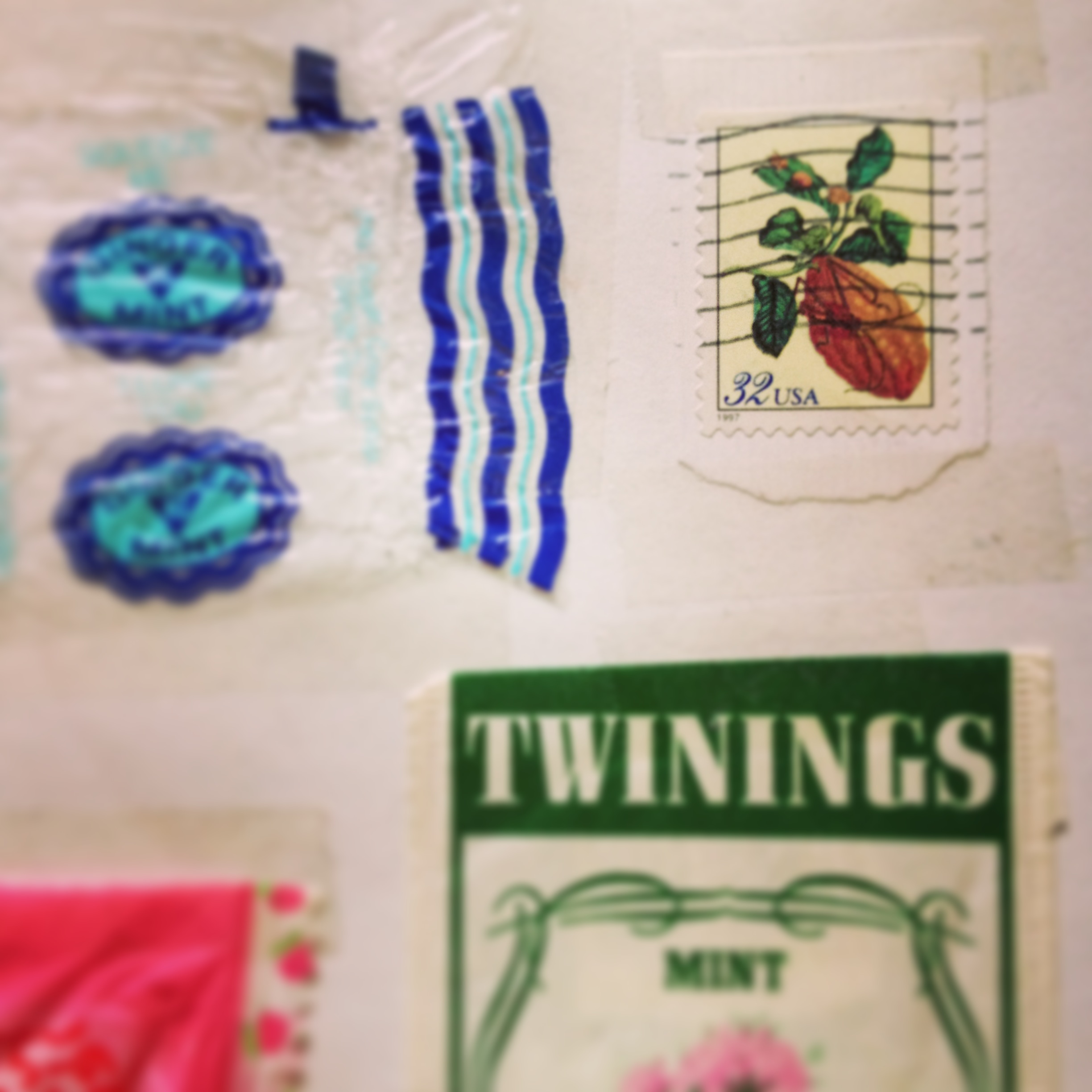
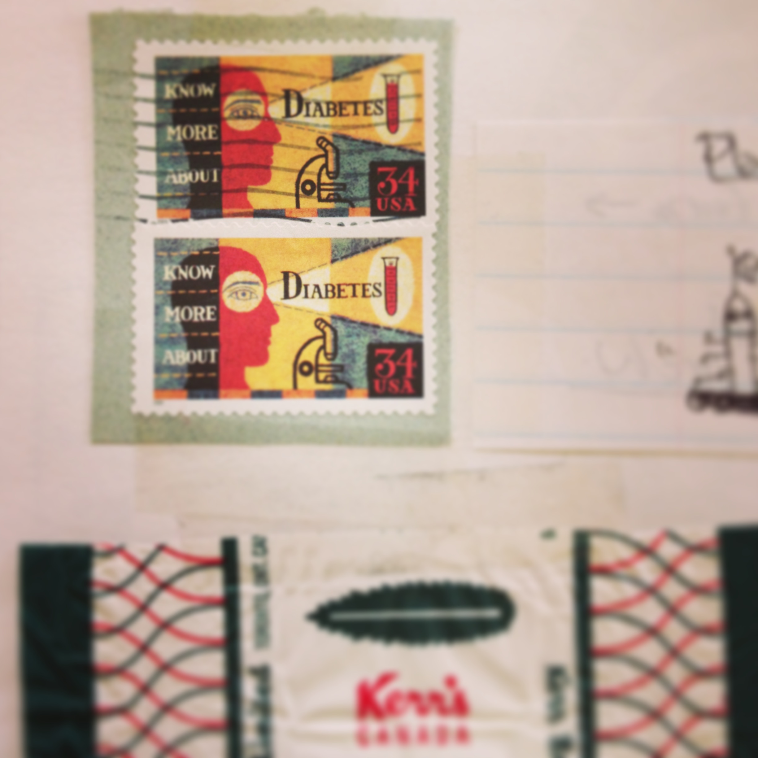
Choose materials you love to look at.  The more aesthetically appealing the stationery, stamps and writing instruments you have, the more likely you’ll want to use them.  Start with stamps! If you aren’t already a regular at your local post office, pick a time of day that won’t be super busy to visit (avoid lunch hour!) and ask to look at some of their limited edition offerings.  Unusual stamps mean that you can take a more minimalist approach to addressing your envelopes if you are not of the “more is more” camp.   Their design and beauty will speak volumes and it’s like giving two gifts to the recipient – a well penned missive and a keepsake.  I still paste my favourites into a scrap book.   Anne Stark Ditmeyer, of the travel blog Prêt à Voyager , recently featured some wonderful stamps of illustrated French Idioms on her instagram feed. Have a look at these irreverent designs and get schooled here .

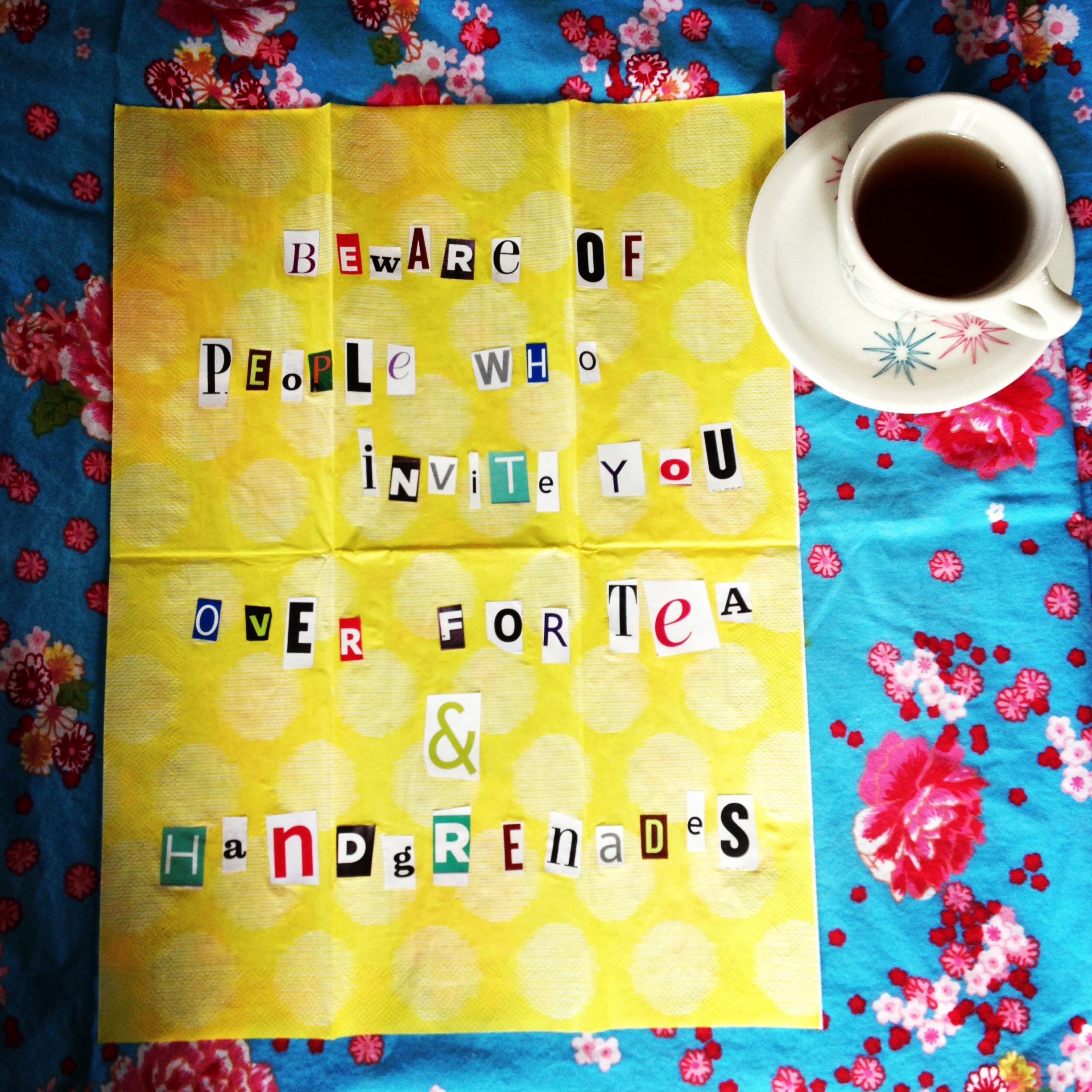
I love this card from Paper Rifle Co.

IMG_3907

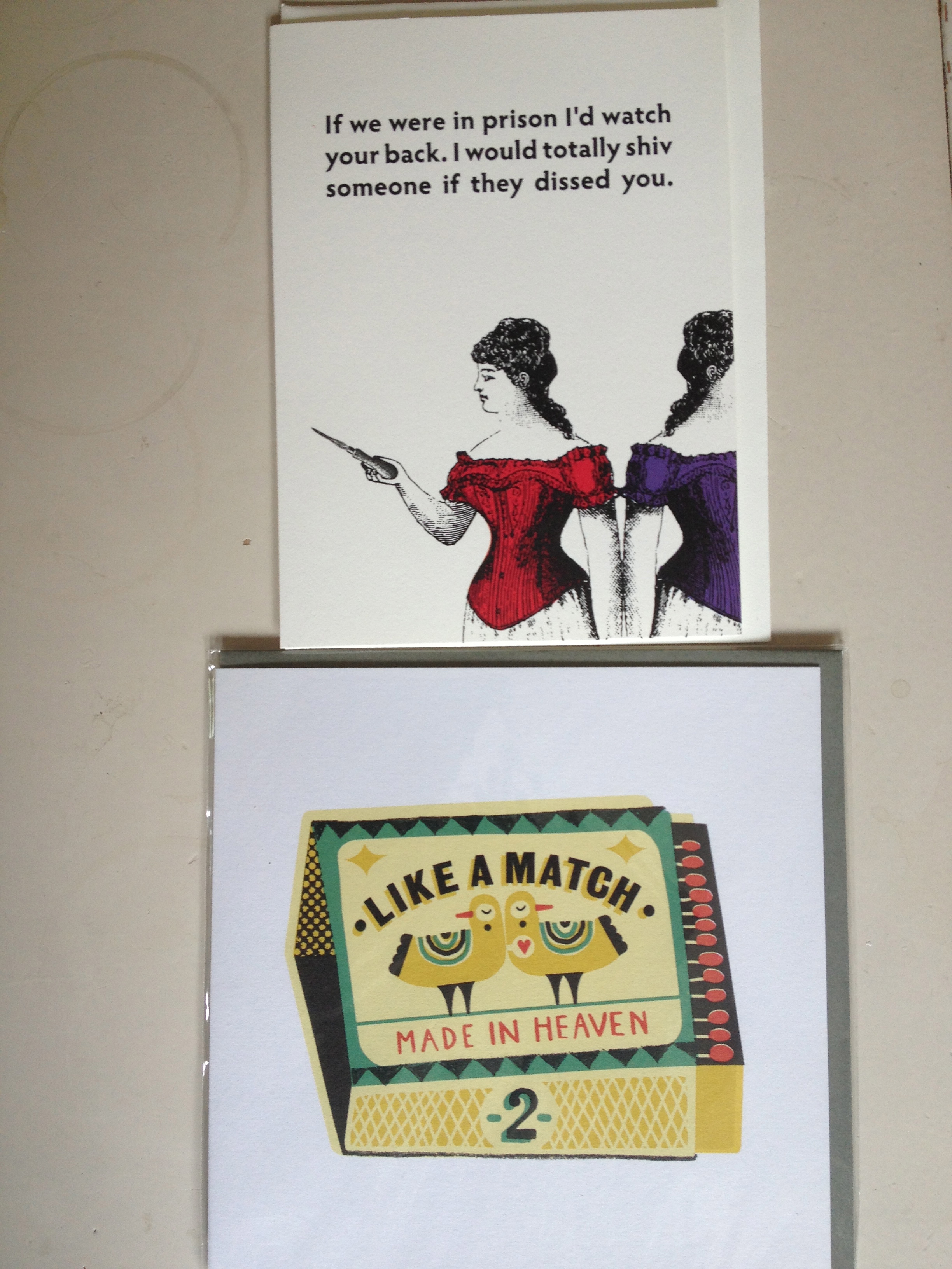
Some favourites from my stash – Shiv card by Seltzer Goods and Like a Match Made in Heaven by Tom Frost for Urban Graphic.

Screen shot 2013-08-01 at 3.50.24 PM

Beautiful custom address stamps by Paper Pastries.  And another reason to buy more Washi tape!

Whether you plan on writing an epic letter or a short and sweet thank you note, there is a multitude of choice when it comes to paper and writing instruments .  Experiment with different mediums – from Bic ballpoints to feathered quill pens,  yellow legal pads  to handmade paper – and find out what your preferences are.  Ultimately it comes down to what feels natural in the hand and on the page.  I love the look and cachet of fountain pens, but they are not well suited to the way I write.  I gravitate towards the more utilitairan, but no less satisfying,  Uniball Vision Rollerballs  and colourful gel pens.   I am a sucker for a darkly humoured “encouragement”  note card and when it comes to full fledged letters, I tend to gravitate towards simple blank sheets housed in a brightly hued envelope.  My handwriting knows no boundaries ( aka chicken scratchings) so I eschew lined paper and allow my cursive some room to roam across the page.

Here are just a few of my favourite resources to get you started if you are looking to add to your stationery stockpile:

Have a curated selection of letter writing goodies sent to your home with monthly stationary subscriptions  from Nicely Noted or Green Gables.

Themed pencil sets that will make you chuckle.

Irreverent rubber stamps and stationery from the Small Object.  My favourite is sunny eyes.

My favourite, David Shrigley postcards at Polite Cards.

Letterpress loveliness from Egg PressYellow Owl Work Shop, Port Paper Co.  and Papillon Letterpress.

Tagged , , , , , , , , , , , , , , , , , , , , , , , , , , , , ,

From The Desk Of

Artist Adam Stennett’s Desk via From the Desk Of

Artist HuskMitNavn’s Desk via From the Desk Of

Graphic Designer Milton Glaser’s desk via From the Desk Of

Following on the heels of my obsession with In the Make‘s studio tours is a new little discovery: From The Desk Of.

No need to feel guilty over your voyeuristic prediliction for other people’s work spaces.  Get your fix right here!

Each desk usually features a combination of on-site shots, photos of projects in process or finished works, and a short  interview about their work space, process, tools, and favourite objects.  I especially love the rare ” inside my desk drawer” money shot.

You’d think that the sprawling and pristine studio workshops in the woods would have me pining for acreage and floor to ceiling windows.  Surprisingly, what I take the most comfort in seeing, are the artists that make their magic in tiny, chaotic spaces.  I  want to believe that I’m not the only one that goes to bed with bits of paperscraps unwittingly glued to her feet.

From The Desk Of is the brainchild of writer/photographer/traveller/cultural enthusiast Kate Donnelly.  She has some pretty neat things going on here and here.

Tagged , , , , , , ,

Raindrops on roses and whiskers on kittens: Uppercase Issue #18

UPPERCASEissue18

18-spreads-ransom1

Did you get the Sound of Music reference?  I’m sure the Von Trapp family would agree with me that Uppercase Magazine deserves a place on anyone’s “favourite things”  list.  Self-described as a publication for the Creative and Curious –  Issue #18 is heavily focused on a medium near and dear to my heart: Collage!

While I’m still waiting for my subscription to arrive, I got a great email yesterday from Erin at Uppercase.  She had a little preview to share from their reader-participation project “The Handsome Ransom Note” that caused an enthusiastic-yet-tragically-inelegant-happy dance at the kitchen table.

18-spreads-ransom2

IMG_2731

Getting to see my stuff in print is new and exhilarating.  Thank you Uppercase, for putting out such a fun call for submission and giving me the incentive to flex my creative muscles.

Want to find out more about what the people behind the magazine are up to? Visit their blog .

Itching to get your hands on a copy?  Subscribe or renew by August 1 using the code “contributor18” and get $10 off. You can also find a list of stockists on their website.

Happy cutting and pasting, my friends!

Tagged , , ,

Are you creatively satisfied?

This is the first in a series of questions asked of creative professionals by The Great Discontent.  The variety of answers are surprising , and challenge my assumptions about the creative contentment of those who are leaders in the world of design and art.

This is how TGD describes their new video project:

Two Minutes with TGD is a series of brief interviews that expands on themes already explored by The Great Discontent: creativity, risk, and what connects us. The series is a TGD special project, introducing video content in addition to our regularly published written interviews.

Can’t wait to see more!


Tagged , , ,

Busy plotting…

Phil Francis’ Morning Commute Banana Map originally posted on Pret a Voyager

…how to make a map, that is!  In the midst of a jam-packed work week, I decided to throw caution to the wind and  sign up for Anne Ditmeyer’s Skillshare class Map Making: Learn to communicate places beautifully .   I came across Anne’s fantastic travel blog while researching last year’s trip to Paris and marvelled at what an incredible life she has created for herself.  Swoon worthy!  Recently, I discovered Anne was sharing her many talents in the form of an online class and I jumped at the chance to participate.

I sure wish I’d had the foresight to keep some of the impromptu maps I’ve drawn for visiting friends over the years.   I would love to see what landmarks were deemed important back then, some of which I believe would include:  best place to get roti, well-loved bookstores, anarchist coffee shops and least gross laundromats.

Anne’s Pinterest board, Make a Map,  has served as great inspiration .  This map in particular, stood out for me for being so personal and  because it didn’t require computer skills. Low-tech love!

Source: itsnicethat.com via Anne on Pinterest

This one is by Toronto’s own map-making maestro, Marlena Zuber.

Source: maps.marlenazuber.com via Anne on Pinterest

And here is a quickie first sketch of a project I’m working on.  More details to come!

IMG_3321
Tagged , , , , , , , , ,

Divine Detail: Leah’s hand-drawn signs

IMG_2889When visiting The Paper Place,  a Toronto-based mecca for paper and craft lovers, brace yourself to be wooed by the quality and selection of goods at your fingertips.   Having had the good fortune of working there many years ago, in it’s former incarnation as the Japanese Paper Place, I can attest to the thrill of seeing a “first-timer” walk in and pause, pupils visibly dilating with joy .    Nowadays, as a seasoned customer, I would love to draw your attention to one of my favourite details about the store:  Leah’s hand drawn signs.

IMG_2888

IMG_2887

Her sense of humour shines and her style will forever be recognizable to me, even on such a tiny scale.  Leah remains one of my favourite co-workers of all time, and I fondly remember my lame attempts to crack her up, each and every shift we shared.  In truth, she’s the really funny one.  I wish I’d kept better track of the silly notes we used to exchange or better yet, all the signs she’s ever made in the past two decades. Now that would be a show I would love to curate!  Here are the gems in my “personal collection”.

"Michelle. This is NOT real food...  "  Cerise

FYI post-it, left on  a pile of fruit-print origami I wanted to buy: “Michelle. This is NOT real food… ” Cerise

The two-inch “Kalmic Book” , our take on Spy Vs Spy: IMG_2928

IMG_2929

Does anyone else get this location-centric joke?

IMG_2931

IMG_2932

Leah is no one trick pony, check out this project she did for the Paper Place using handmade Kozo cards.

I miss you, Poopy.  Love, Snarky.

Tagged , , , , , , ,

Covet Garden

734503_586045728081946_1429681791_n

The latest issue of the online design magazine, Covet Garden,  launched this week and I’m so chuffed that we got to be a part of the magic – even if it feels like I’ve just hung my knickers out on the washline for all to see.  (Thanks for the perfect analogy, Tracy!).  Have a peek inside our happy hobo home.

The Covet Garden crew are some of the most creative, funny, and hard-working people I know.  With a mandate to showcase interesting homes that aren’t styled by decorators, they truly deliver on their mission to be “inspirational, not aspirational”.  They deserve all the praise they have been receiving from stylish fans like bloggers sfgirlbybay and my scandinavian home.

As if it weren’t thrilling enough to be featured, the cover art is the work of amazing illustrator Alanna Cavanagh.  Pinch me, please.

For more design goodness, check out the Covet Garden blog  and co-founder Rhonda Riche’s Gracious Good’s blog.

Tagged , , , , , , , , , ,